The project was created with the intention to complete the new complex of buildings in Via Larga, Bologna. The landscape therefore has two functions: the first is to represent the “green identity” of companies that fit into the different buildings, secondly it is not only a purely aesthetic element but also accessible and liveable and designated to every kind of user of this space.
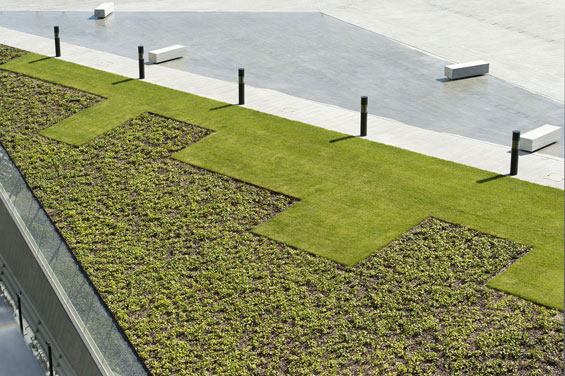
Basing on these principles take form various green areas which are different in dimensions, characteristics and green species. The common theme in all areas is the development of green as formal volume: the vegetable masses are combined and intersect each other creating a play of heights, visible from the ground, and a pattern of coloured geometries designed foremost for the view from the top of the Tower, the principal element of the entire sector.
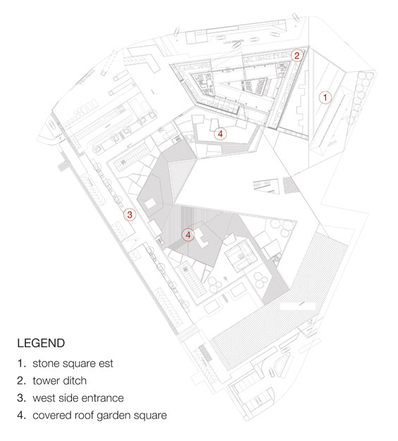
1. STONE SQUARE EST
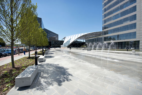
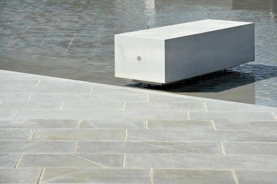
In the area of the square paving with Pietra forte Fiorentina (a particular kind of sandstone) the rhythm is given by the geometry of triangular lines on the ground. The inclined plane that faces the tower takes up this geometry continuing this geometric outline. The segmented draw is defined by two different essences: on the top part the lawn, and below a ground covering Hedera helix Helix. The inclinate plane become in that way a different point of view to the Tower, where people can sit and stay for a relaxing moment.
On the est side of the stone square a not aligned sequence of Carpinus trees creates a green filter between the busy street and the tranquillity of the area.
2. TOWER DITCH
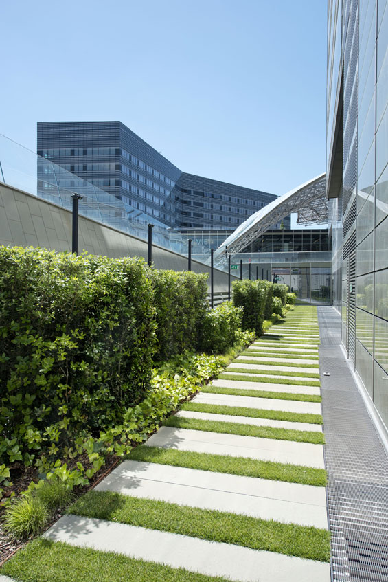
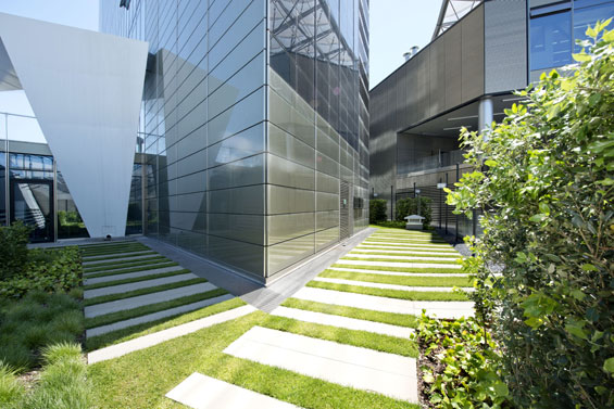
In the area of the Tower ditch a long walkway, consisting of slabs of Pietra forte Fiorentina alternating with strips of lawn, follows the perimeter of the building. On its side different forms and species are combined to create a pleasant pattern of volumes and colors that accompany the visitor along the entire path.
With the same carefulness with which are studied aesthetic and formal aspects of the project, are also treated technical details for the realization of the entire space. Stone plates, which have a bush-hammered surface finish, are treated with a inferiorly layer of waterproofing material to ensure the better durability during years and even with adverse weather conditions.
The species are selected with the intent to obtain a space changeable depending on the alternation of the seasons, but always of high quality. For this reason, Frassinagodiciotto choose to use both evergreen and both deciduous species.
3. WEST SIDE ENTRANCE
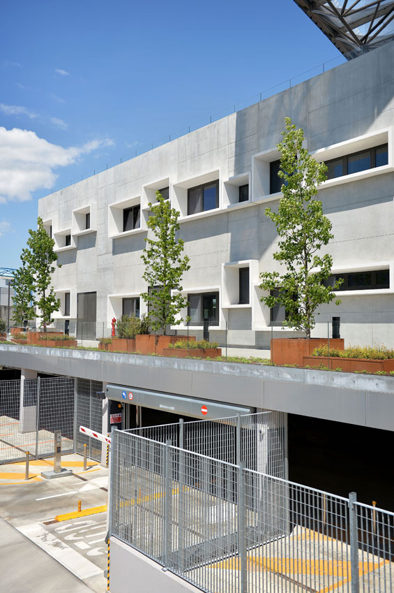
At the rear of the gym building the project of the green refers to the modular and irregular windows arrangement which characterize the building’s facade.
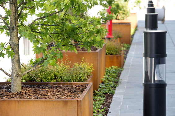
Carters in corten steel of different heights and sizes intersect one to the other creating a green movement. The essences are high and low, with tall Liquidambar trees that jut into the sky.
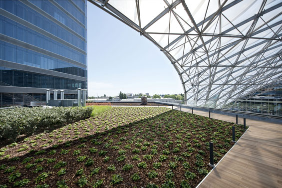
4. COVERED ROOF GARDEN SQUARE
The area extends over the roof of the gym building and under the cover of the technique “Vela”, the characteristic element of the covered square.
The space is divided into two environments: the first one is a roof garden dedicated to Unipol offices, the other is the solarium area of the exclusive Prime gym.
There, large green volumes define the paths and the perimeter of the area, isolating the solarium from the surrounding context. The wood floor covers almost the entire surface, with gravel inserts in correspondence of green areas, making the environment pleasurable and cozy.
The entire project has been studied in function of obtaining LEED certification (Leadership in Energy and Environmental Design), a system of certification of environmental and energy performance of buildings developed in the United States. According to LEED, the Tower reached a rating GOLD, Index of excellence in the process of design and construction.
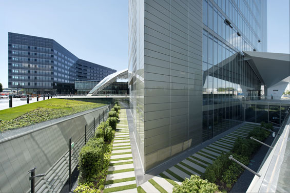
Unipol Tower | Via Larga Italy | Frassinagodiciotto
Landscape Design firm: Frassinagodiciotto
Photo credits: Giovanni De Sandre Ph.
Text credits: Frassinagodiciotto
Architectural Design: OPEN Project


Comments are closed.